Luup plugins: Static JSON file
(Added AfterInit documentation) |
|||
| (2 intermediate revisions by one user not shown) | |||
| Line 129: | Line 129: | ||
content directly in a cpanel in the Control tab. | content directly in a cpanel in the Control tab. | ||
| − | [[File: | + | [[File:AfterInit.png|image|center|AfterInit]] |
| − | This image is taken from MiOS implementation of PhilipsHue plugin . As you can see the part | + | This image is taken from the MiOS implementation of the PhilipsHue plugin . As you can see the part |
which is situated below the dashed line is inserted via Javascript code. In order to achieve this, | which is situated below the dashed line is inserted via Javascript code. In order to achieve this, | ||
the following json was used for the ‘Control’ tab: | the following json was used for the ‘Control’ tab: | ||
| Line 142: | Line 142: | ||
"Position": "0", | "Position": "0", | ||
"TabType": "flash", | "TabType": "flash", | ||
| + | "TopNavigationTab": 1, | ||
"AfterInit": { | "AfterInit": { | ||
"ScriptName": "J_PhilipsHueLamp2.js", | "ScriptName": "J_PhilipsHueLamp2.js", | ||
| Line 150: | Line 151: | ||
</source> | </source> | ||
| + | * '''TopNavigationTab''' | ||
| + | : Must be set to 1 for AfterInit to work | ||
* '''AfterInit''' | * '''AfterInit''' | ||
: object which contains two properties: | : object which contains two properties: | ||
Latest revision as of 17:05, 12 June 2016
Starting in UI4, Luup plugins can specify a static JSON file. This file describes how the plugin appears in the web interface.
Contents |
[edit] What the static JSON file controls
- The icon used by the plugin in the dashboard.
- The text that displays in the one-to-two-row status message in the dashboard.
- Whether the icon changes depending on the value of a variable in the device (for example, a binary light's icon changes from lit to unlit).
- The tabs that appear in the device's detail dialog (when you click the wrench/spanner).
- The content of these tabs.
- The triggers or events that are available for the device in the "Triggers" or "Events" tag of a scene.
[edit] Referencing the static JSON file from the Device XML file
The device XML file (customarly D_PluginName.xml) contains a reference to the static JSON file, in the staticJson element. Place the element as a child of the device element:
  <?xml version="1.0"?>
  <root xmlns="urn:schemas-upnp-org:device-1-0">
    <specVersion><!-- ... --></specVersion>
    <device>
      <deviceType>urn:schemas-futzle-com:device:holidayvirtualswitch:1</deviceType>
      <staticJson>D_HolidayVirtualSwitch1.json</staticJson>
      <!-- ... -->
Capitalization is important, as with all XML.
The static JSON file is customarily called D_PluginName.json.
[edit] The static JSON file
The static JSON file is a single JSON object (associative array).
[edit] Root keys
These keys have been seen at the top level in static JSON files in the wild:
- flashicon
- The device's icon, as a string. Despite the name, the icon is no longer related to Adobe Flash in UI4 or UI5. See Luup plugin icons.
- imgIconBody
- Ignored in UI5.
- imgIconDimmable
- Ignored in UI5.
- imgIconTurnable
- Ignored in UI5.
- imgIconMin
- Ignored in UI5.
- imgIconMax
- Ignored in UI5.
- halloIconsDir
- Ignored in UI5.
- inScene
- When included and set equal to one, it enables any buttons, etc located on the "dashboard box", so they can be selected in the scene editor for use in scenes, rather than being grayed out.
- DisplayStatus
- A JSON object (associative array). For devices where the icon changes based on a variable's value, describes which variable, and the range of values that produce different icon images. See Luup plugin icons.
- state_icons
- A JSON array. For devices where the icon changes based on a variable's value, describes which icon files exist. See Luup plugin icons. Used only in firmware 1.5.401 or later.
- doc_url
- A JSON object (associative array). In UI5, the only item in this object which is used is doc_page. It controls which page in docs5.mios.com is brought up when you click on the help (?) icon in the device control panel.
- Tabs
- A JSON array. Describes the tabs in the detail dialog, and what subset of the first tab appears in the dashboard. See Luup plugin tabs.
- ToggleButton
- ?????
- DeviceType
- A JSON string. Must match the deviceType element in the corresponding device XML (D_PluginName.xml) file.
- eventList
- A JSON object (associative array). Describes the events that this plugin can produce. Events are triggers that can fire off actions in scenes. This key is required for UI4, and obsoleted in UI5. For UI5, use the eventList2 tag, which has a different format. For compatibility with both UI4 and UI5 you need the same information in both keys. See UI4 UI5 Migration for more information.
- eventList2
- see eventList, above.
- sceneList
- A JSON object (associative array). Describes the actions that this plugin can perform (for instance, as the action in a scene). This key is not required and is ignored in UI5, however it is needed for UI4 compatibility. See UI4 UI5 Migration for more information about its format.
[edit] UI7 Updates
- default_icon
- replace the old "flashicon" from UI5. See Luup plugin icons
- state_icons
- state_icons mechanism has changed in UI7. Please see Luup plugin icons
- TopNavigationTab = top_navigation_tab
In device cpanel, tabs can be placed either in the top part or in the bottom. By default they are put in the bottom part. You can mark your tabs with a special flag so that they can be placed in top navigation bar of the cpanel. If two or more tabs are marked with ‘TabType=”flash”’, only the first one found will be placed in top navigation bar. If you want all of them to be placed there, you have to add ‘top_navigation_tab’ to each one. Let’s assume you have a plugin named ‘MyPlugin’ and you want to put a button in the top navigation bar, which, when clicked, will display a message in the cpanel.
- Add the following lines to the .json device file (D_MyPlugin.json), in the Tabs section:
{
          "Label": {
                "lang_tag": "About",
                "text": "About"
          },
              "TopNavigationTab": "1",
          "Position": "4",
          "TabType": "javascript",
          "ScriptName": "J_MyPlugin.js",
          "Function": "MyPlugin.about"
}
Notice the property ‘TopNavigationTab’ set to the value of ‘1’. This is the line that specifies where to place the tab in cpanel. If you set a value different than 1, the tab will be placed in the bottom part of the cpanel, so always use ‘1’ if you want the tab in the top bar. You can also use ‘top_navigation_tab’.
- Add the following lines of code to your .js file (J_MyPlugin.js):
var MyPlugin = (function(api){
    return {
        about: function() {
            try {
                var html = '<div>This is all about me !</div>';
             api.setCpanelContent(html);
            } catch (e) {
                Utils.logError('Error in MyPlugin.about(): ' + e);
            }
        }
    };
})(api);
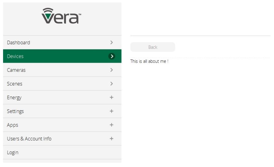
- Perform a lu reload, enter device cpanel and click on ‘About’ button (which is in the top navigation bar of the cpanel) and the result will be something like this:
[edit] Adding Javascript code to Flash tabs
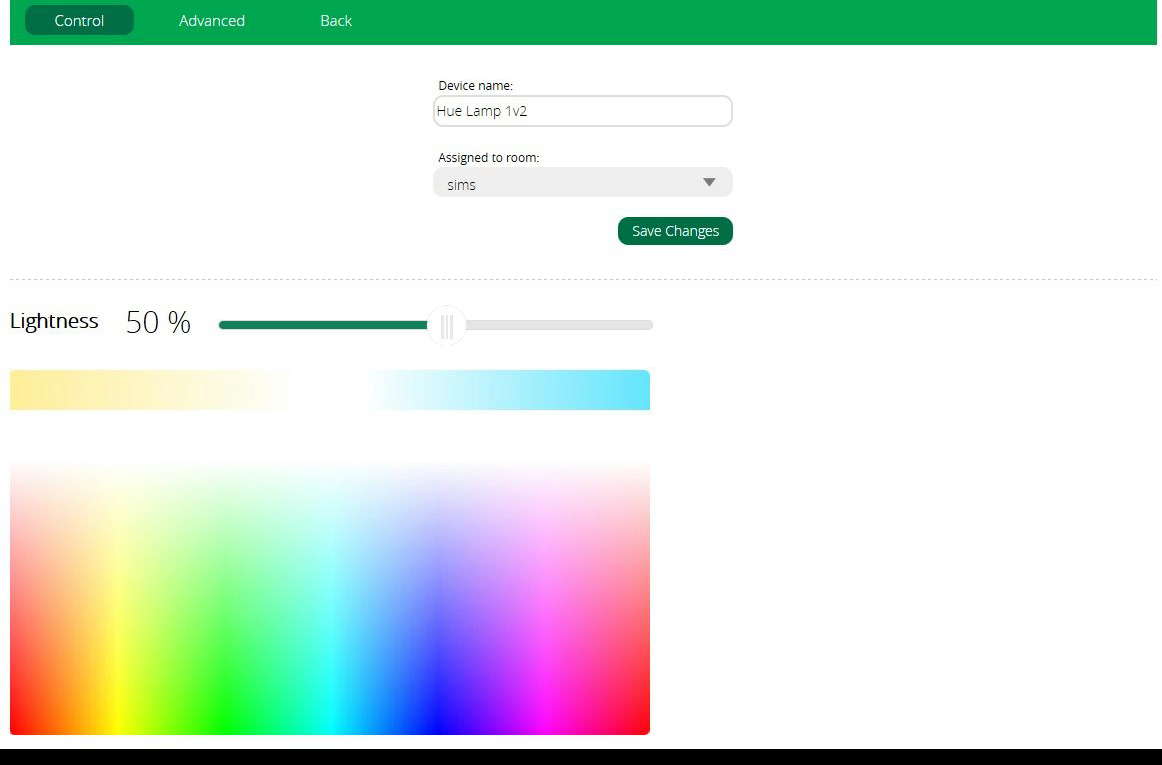
In UI7, Each tab of type flash in a device json can have a property called ‘AfterInit’ which can be used to execute some Javascript code. This way a developer can “insert” custom defined content directly in a cpanel in the Control tab.
This image is taken from the MiOS implementation of the PhilipsHue plugin . As you can see the part which is situated below the dashed line is inserted via Javascript code. In order to achieve this, the following json was used for the ‘Control’ tab:
{
          "Label": {
                    "lang_tag": "control",
                    "text": "Control"
          },
          "Position": "0",
          "TabType": "flash",
          "TopNavigationTab": 1,
          "AfterInit": {
                    "ScriptName": "J_PhilipsHueLamp2.js",
                    "Function": "PhilipsHueLamp2.color_picker"
          } ,
          ...
}
- TopNavigationTab
- Must be set to 1 for AfterInit to work
- AfterInit
- object which contains two properties:
- ScriptName
- specifies the .js file where the function resides; the .js file is loaded when the user enters the cpanel
- Function
- specifies the name of the function to execute
[edit] Position device controls for generic devices
In UI7, devices are split into two categories: specific and generic. Specific devices are those which have a predefined design (like binary light, thermostat, dimmable etc.). Generic devices are those created by plugin developers.
[edit] Positioning controls in ‘device view’
The controls for generic devices are placed inside the device container based on the order in which are found in device .json file and so, each control is drawn to the right of the previous one. If a control doesn’t fit in the remaining space it will be drawn on the following line. This rule will guarantee that the look of a device will be the same on the Web, but also on the mobile apps.
In order to achieve this, but also to maintain backward compatibility with UI5, the developer can add new properties to the device .json, but doesn’t have to change the existing ones.
In the WEB UI, each control is contained in a div element which is positioned using float: left CSS property.
The size of the controls can be altered using properties like ‘HorizontalMultiplier’ which multiplies the default width of a control with a given float number.
To force a control to be positioned on the next line, a special device control was created: ‘line_break’.
To insert a space between two controls, the developer can use the newly created device control: ‘spacer’, which also accepts ‘HorizontalMultiplier’ property.
[edit] Tutorial
We will start with a device that contains no controls.
- First, we need a SceneGroup with id 1 and a ControlGroup with id 1 which belongs to the previous added scene group (this is the same as in UI5)
"SceneGroup": [
   {
       "id": "1",
       "top": "1",
       "left": "0",
       "x": "2",
       "y": "3"
   }
],
"ControlGroup": [
   {
       "id": "1",
       "isSingle": "1",
       "scenegroup": "1"
   }
]
- Then, add a control of type ‘button’ with a label: ‘My First Button’. Create it using the same definition as in UI5. Be sure to set the ControlGroup of the button to be equal to 1:
{
   "ControlGroup": 1,
   "ControlType": "button",
   "ControlCode": "my_button",
   "top": 0,
   "left": 0,
   "Label": {
       "lang_tag": "my_first_button",
       "text": "My First Button"
   },
   "Display": {
       "Service": "urn:micasaverde-com:serviceId:MyPlugin1",
       "Variable": "Status",
       "Value": "1",
       "Top": 200,
       "Left": 50,
       "Width": 100,
       "Height": 20
   },
   "Command": {
       "Service": "urn:micasaverde-com:serviceId:MyPlugin1",
       "Action": "SetStatus",
       "Parameters": [
           {
               "Name": "Status",
               "Value": "1"
           }
       ]
   }
},
- By now, your device will look something like this:
- Notice that the text doesn’t fit properly inside the button. Add "HorizontalMultiplier": "2" property to your control definition. This will set the width of the button to double the default size. By now, your device will look like this:
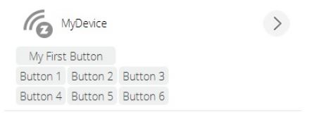
- Add 6 more buttons using the same template as above, but don’t set the “HorizontalMultiplier” property. Use labels: ‘Button 1’, ‘Button 2’, … ‘Button 6’. It will look like this:
- Notice that the latest 6 buttons will be added to the right of the previously added ones; if the button doesn’t fit in the remaining space it will be placed on the next line
- We decide to move buttons 1-3 on a separate line and buttons 4-6 on another line; to do so, add a control of type ‘line_break’ at the end of ‘My First Button’ and at the end of ‘Button 3’. The syntax is the following:
{
   "ControlGroup": 1,
   "ControlType": "line_break"
}
- And the result is like this:
- If you want some space between the buttons you can use ‘spacer’, like this:
{
   "ControlGroup": 1,
   "ControlType": "spacer",
   "HorizontalMultiplier": "0.7"
}
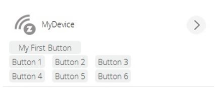
- The result:
- Here is the full definition of the Control array (highlighted with blue you can see UI7 specific properties):
{
   "HorizontalMultiplier": "2",
   "ControlGroup": 1,
   "ControlType": "button",
   "ControlCode": "my_button",
   "top": 0,
   "left": 0,
   "Label": {
       "lang_tag": "my_first_button",
       "text": "My First Button"
   },
   "Display": {
       "Service": "urn:micasaverde-com:serviceId:MyPlugin1",
       "Variable": "Status",
       "Value": "1",
       "Top": 200,
       "Left": 50,
       "Width": 100,
       "Height": 20
   },
   "Command": {
       "Service": "urn:micasaverde-com:serviceId:MyPlugin1",
       "Action": "SetStatus",
       "Parameters": [
           {
               "Name": "Status",
               "Value": "1"
           }
       ]
   }
},
{
   "ControlGroup": 1,
   "ControlType": "line_break"
},
{
   "ControlGroup": 1,
   "ControlType": "button",
   "ControlCode": "button_1",
   "top": 0,
   "left": 0,
   "Label": {
       "lang_tag": "button1",
       "text": "Button1"
   },
   "Display": {
       "Service": "urn:micasaverde-com:serviceId:MyPlugin1",
       "Variable": "Status",
       "Value": "21",
       "Top": 200,
       "Left": 50,
       "Width": 100,
       "Height": 20
   },
   "Command": {
       "Service": "urn:micasaverde-com:serviceId:MyPlugin1",
       "Action": "SetStatus",
       "Parameters": [
           {
               "Name": "Status",
               "Value": "21"
           }
       ]
   }
},
{
   "ControlGroup": 1,
   "ControlType": "spacer",
   "HorizontalMultiplier": "0.7"
},
{
   "ControlGroup": 1,
   "ControlType": "button",
   "ControlCode": "button_2",
   "top": 0,
   "left": 0,
   "Label": {
       "lang_tag": "button2",
       "text": "Button2"
   },
   "Display": {
       "Service": "urn:micasaverde-com:serviceId:MyPlugin1",
       "Variable": "Status",
       "Value": "22",
       "Top": 200,
       "Left": 50,
       "Width": 100,
       "Height": 20
   },
   "Command": {
       "Service": "urn:micasaverde-com:serviceId:MyPlugin1",
       "Action": "SetStatus",
       "Parameters": [
           {
               "Name": "Status",
               "Value": "22"
           }
       ]
   }
},
{
   "ControlGroup": 1,
   "ControlType": "spacer",
   "HorizontalMultiplier": "0.7"
},
{
   "ControlGroup": 1,
   "ControlType": "button",
   "ControlCode": "button_3",
   "top": 0,
   "left": 0,
   "Label": {
       "lang_tag": "button3",
       "text": "Button3"
   },
   "Display": {
       "Service": "urn:micasaverde-com:serviceId:MyPlugin1",
       "Variable": "Status",
       "Value": "23",
       "Top": 200,
       "Left": 50,
       "Width": 100,
       "Height": 20
   },
   "Command": {
       "Service": "urn:micasaverde-com:serviceId:MyPlugin1",
       "Action": "SetStatus",
       "Parameters": [
           {
               "Name": "Status",
               "Value": "23"
           }
       ]
   }
},
{
   "ControlGroup": 1,
   "ControlType": "line_break"
},
{
   "ControlGroup": 1,
   "ControlType": "button",
   "ControlCode": "button_4",
   "top": 0,
   "left": 0,
   "Label": {
       "lang_tag": "button4",
       "text": "Button4"
   },
   "Display": {
       "Service": "urn:micasaverde-com:serviceId:MyPlugin1",
       "Variable": "Status",
       "Value": "24",
       "Top": 200,
       "Left": 50,
       "Width": 100,
       "Height": 20
   },
   "Command": {
       "Service": "urn:micasaverde-com:serviceId:MyPlugin1",
       "Action": "SetStatus",
       "Parameters": [
           {
               "Name": "Status",
               "Value": "24"
           }
       ]
   }
},
{
   "ControlGroup": 1,
   "ControlType": "spacer",
   "HorizontalMultiplier": "0.7"
},
{
   "ControlGroup": 1,
   "ControlType": "button",
   "ControlCode": "button_5",
   "top": 0,
   "left": 0,
   "Label": {
       "lang_tag": "button5",
       "text": "Button5"
   },
   "Display": {
       "Service": "urn:micasaverde-com:serviceId:MyPlugin1",
       "Variable": "Status",
       "Value": "25",
       "Top": 200,
       "Left": 50,
       "Width": 100,
       "Height": 20
   },
   "Command": {
       "Service": "urn:micasaverde-com:serviceId:MyPlugin1",
       "Action": "SetStatus",
       "Parameters": [
           {
               "Name": "Status",
               "Value": "25"
           }
       ]
   }
},
{
   "ControlGroup": 1,
   "ControlType": "spacer",
   "HorizontalMultiplier": "0.7"
},
{
   "ControlGroup": 1,
   "ControlType": "button",
   "ControlCode": "button_6",
   "top": 0,
   "left": 0,
   "Label": {
       "lang_tag": "button6",
       "text": "Button6"
   },
   "Display": {
       "Service": "urn:micasaverde-com:serviceId:MyPlugin1",
       "Variable": "Status",
       "Value": "26",
       "Top": 200,
       "Left": 50,
       "Width": 100,
       "Height": 20
   },
   "Command": {
       "Service": "urn:micasaverde-com:serviceId:MyPlugin1",
       "Action": "SetStatus",
       "Parameters": [
           {
               "Name": "Status",
               "Value": "26"
           }
       ]
   }
}


